E-commerce is a complex endeavor requiring a lot of puzzle pieces falling into place. Small online business owners juggle dozens of tasks, and it’s easy to become overwhelmed and wind up with a site that’s cluttered and hard to navigate.
Total retail trade e-commerce in the United States was about $389.1 billion at the government’s last measurement and
another $608.7 billion in service industries. If you spend all your time focused on creating a pretty site, you’ll have something of beauty, but it may not be as effective at grabbing a slice of that e-commerce pie as one that’s simple and easy to use.
Fortunately, you can take six easy steps to simplify your e-commerce site and make it as functional as possible.
1. Focus on Delivery
One of the first things you should consider is your delivery foundation. The fastest way to lose a customer is with slow or spotty delivery. Work hard to find a courier you trust and who has a reputation for reliability. One key element is how the delivery service handles the situation when there’s a delay. If they keep you informed, you can keep your customer informed. Anything you can do to speed up your delivery while reducing costs is a positive for your business.
How does this step apply to your website? Once you have a shipping system you trust, you can indicate guaranteed delivery or reduced delivery cost or time to your customers on the site itself.in general are masters at this, often displaying associated products and accessories on product pages and in baskets. Someone looking at a particular laptop can be presented with a selection of slightly-better (and more expensive) laptops, for instance, encouraging them to “upgrade” their purchase.
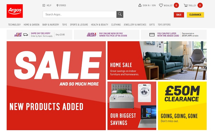
Argos heavily advertises their super-fast delivery times. Land on their homepage, and you see options for same-day delivery when you order by 6 p.m. They offer this option because they know they can rely on their delivery system. They also provide two-person delivery for larger items, and you can choose your delivery day.
2. Cut the Clutter
Spend time on your homepage and look at the different elements in place. Keep in mind the action you want users to take when they land on your page. Is everything on the page pointing toward your goal, or are there a bunch of elements that aren’t related? Cut anything that doesn’t funnel visitors to the action you want them to take. You can always add these elements to a secondary page or category, but they shouldn’t live on your landing page.
Make it a goal to cut all but two or three main elements from your landing pages. Put the focus on action and make it simple for users to figure out what action you’d like them to take.
3. Keep Forms Short
As an e-commerce store, you’ll find email marketing quite successful as you add new products and offer special sales. However, if users have to fill in multiple fields to sign up for that newsletter, you’re more likely to lose out on a lead than gain a newsletter subscriber. In one case study, a website reduced the number of form fields from nine to five and saw a 13.4 percent increase in conversion rate.
Shopify offers an option to sign up for their newsletter that’s simplified down to a single field collecting the visitor’s email address. Although the form itself is very short and to the point, the CTA is set off with a red background and big bold letters that draw the user’s eye. You can simplify your forms and still make them eye-catching.
4. Allow Guest Ordering
Don’t force site visitors to register for an account with you. Not everyone wants to take time out of their busy schedule to fill out a registration form, go to their email to activate the registration and then come back and complete the order. Give users the option of ordering using PayPal information or with a few simple clicks.
Ask only for the information you must have to complete the order. Once you have their address and email, you can easily fulfill the order. Invite them to sign up for special offers through your newsletter when you confirm the item shipped.
5. Focus on Images
While product descriptions are important, if the online shopper can’t see vivid images of the products they consider, they’re less likely to make a purchase. Would you buy something without first seeing what it looked like? If you focus only on a few things on your website, focus on detailed images that define your products.
Note the beautiful photos of their products in action. The images are bright and exciting, and they also fill the background with a picture of someone using one of their tools.
6. Reduce Steps to Checkout
Look at your checkout process from a user’s viewpoint. Are there steps that aren’t needed? Figuring out how to reduce the number of steps from start to finish increases the odds that the user will follow through with the purchase rather than abandoning their shopping cart.
Simplicity Is on Trend
More and more sites have a clean, uncluttered look today. Get rid of elements you don’t need and put the focus on the most critical aspects of your products and sales funnel. With a little adjustment, your conversions will increase, and your site visitors will sing your praises.


