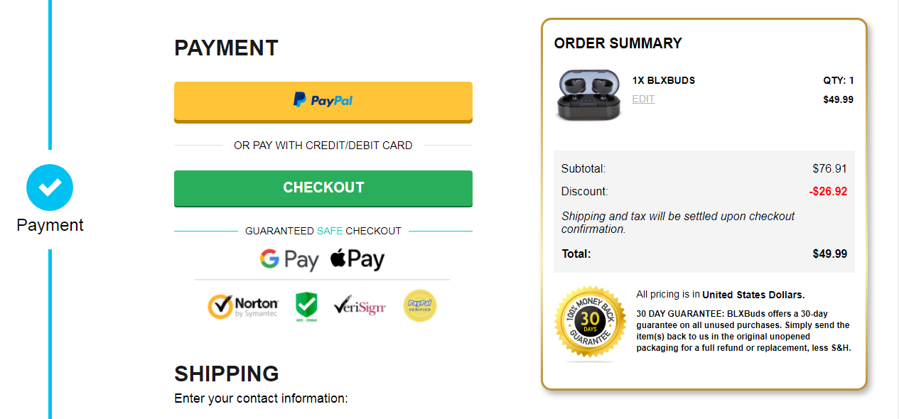
The checkout page is the final stage of your customer’s online buying journey, but is arguably the most important one. It is where they will confirm their purchase, meaning another user you can safely say has ‘converted’ into a sale. Although ads, landing pages and everything that comes before the checkout are just as important to moving the customer along the purchase funnel, the checkout is your store’s moment of truth.
At the start of 2022, the Baymard Institute aggregated results from 41 studies to work out an average figure for ecommerce cart abandonment rate. It was stated within the report that the average figure stands at 69.57%. This means that only an approximated 30% of users who add items to their cart and reach your checkout page will end up purchasing.
Considering this figure, there is no need to freak out over a seemingly large proportion of people abandoning your site on the checkout page.
Why do users abandon ship on the checkout page?
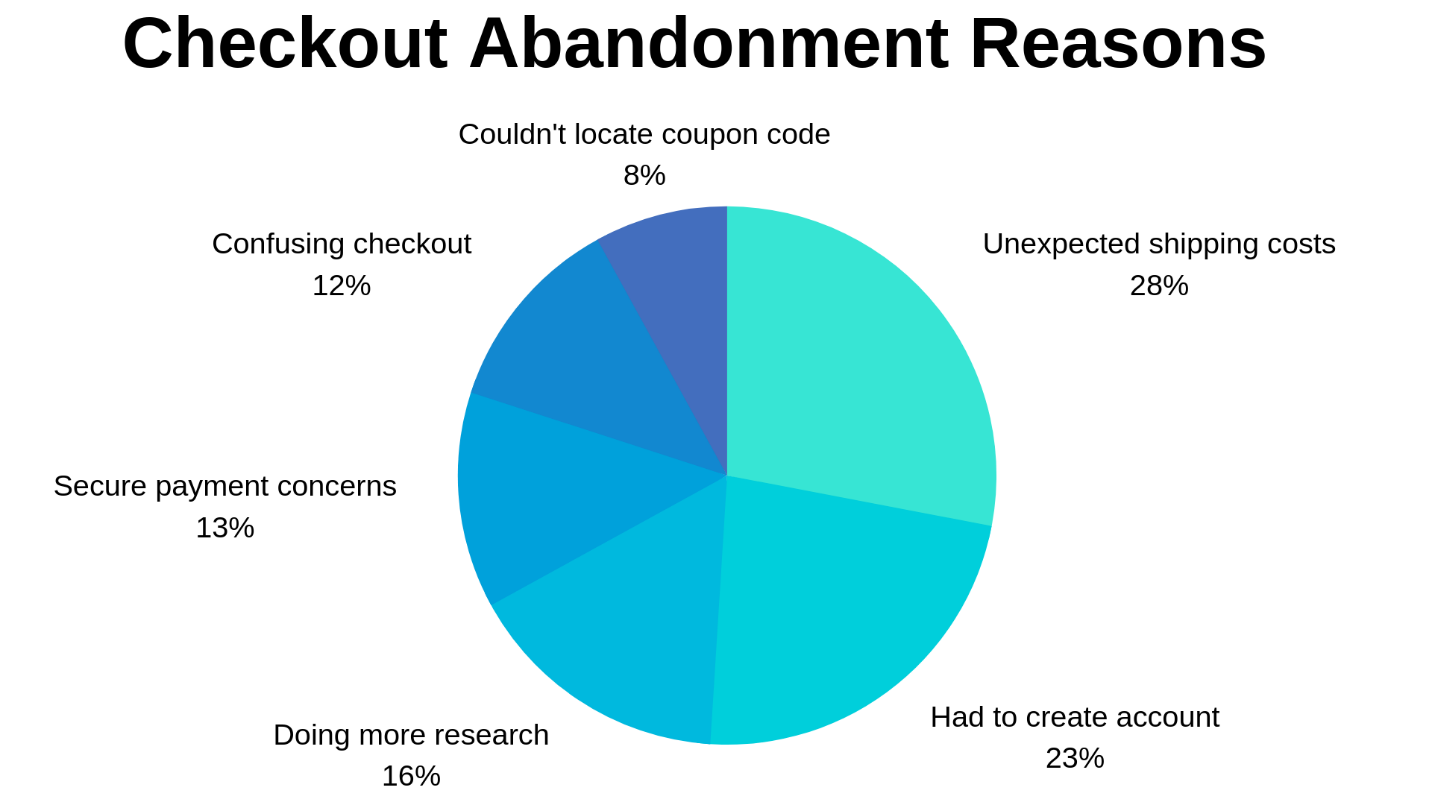
According to US consumer research, some of the top reasons for abandoning a cart on the checkout page are as follows:
- Shipping rates become added on to the total price of the order, and it gets too expensive.
- Customers want to reach the checkout page to know your final price, before heading to other sites to compare.
- The order did not qualify for free shipping.
Customers should be expected to shop around for the best deals, so include a feature that will keep yours front of mind, or even prevent them from needing to look elsewhere. They also won’t be best pleased if unexpected costs rear their ugly head during the checkout process. Apart from these more obvious fixes, what else can be done to ensure a well-converting checkout page?
How to design a killer checkout page
There are definitely things you can implement in order to improve your chances of increasing checkout page conversion, however. Let’s take a look at some of the most well-researched tactics.
#1) Test a single-page checkout
Checkout processes that span several pages are more at risk of losing the customer. It is well-known that the more clicks a customer needs to make, the more likely they are to drop off. If you can work product, shipping, and payment information into the one page, you might be onto a winner.
If you must have a multi-page checkout for whatever reason, give your shopper a visual progress indicator to show them what step they’re in. This at least gives them some sense of how many steps they have left in the checkout process, alleviating any frustration over the multi-step interface.
#2) Make sure the checkout is a secure experience
With more people becoming increasingly aware of online fraud, security signals are your best bet for ensuring a potential buyer isn’t thrown off by fears over their data. Some of the security features most people would look for on a product page include the padlock symbol in the HTML bar, or security badges from the likes of McAfee.
With almost half of Americans having fallen victim to credit card fraud over the last five years, you need to make sure that your checkout page is a place where everyone can feel their payment details and personal data are secure.
A secure checkout experience fosters trust, which is one of the pillars of conversion.
#3) Give the option of a guest checkout
By not forcing users to create an account with you, you can eliminate the problem caused by the second largest bar in the chart below.
As tempting as it is to gather as much information about the people who browse your site, you can collect email addresses later. Showing users a sign-up page just before they are about to checkout is a huge disruption, and something which a large portion of people aren’t prepared to go through.
#4) Be flexible with your payment options
It won’t serve you well only to offer payment via one type of card. If a user wants to purchase a product but they cannot see their preferred payment method listed, they likely won’t take their interest any further. Make sure to accommodate alternative payment options like PayPal or Stripe – these are increasingly popular.
#5) Limit form fields to only necessary information
If you do present your shopper with a form to fill, only include the important bits. A customer that catches a scent of unnecessary form fields for advertising metric gain, is only going to repay you by closing their browser. Keep things limited to name, delivery information and email address.
#6) Save your upsells for afterwards
Post-purchase upsells are given that name for a reason. You really don’t want to distract a customer on the brink of purchase with a couple of different offers, before they have even finalized the primary transaction. This could only end up clouding their vision and sending them off to other sites in the name of comparison.
Testing is crucial
None of the tips mentioned throughout this article are guaranteed quick-fixes to your checkout page’s conversion rates. Simply put, they are well-researched ideas which have been proven to raise checkout conversion rates on many ecommerce sites. In order to achieve the same effect on your site, monitoring key statistics while you implement and test changes will be the answer.
To get a clear idea of how your changes perform, ensure that you test mobile performance as well as desktop. Many people now browse ecommerce stores from their mobiles, so you will want to nail down the checkout page on this platform too.


